The Immortal Iron List exists to emphasize those things which stand out among their peers. Those things which are a little different in a huge way. Like the hero The List is named for, it stands as a testament to the immortality of ideas. The List might be ranked, it might not. It might be humorous, or it might not. The only thing The List always is, is Iron, definitive and everlasting.
1. Vektor – Terminal Redux

Vektor not only has achieved the feat of best metal album cover of the year, they have created perhaps the best metal album of the decade with Terminal Redux. The cover does the album justice, suggesting an endless, dangerous space from which a colossal, evil presence emerges. Metal album covers have always tried to achieve a balance of badass and intellectual, or at the very least edgy and weird. Terminal Redux accomplishes everything that a metal album cover should aspire to be, and it helps that the album contained is one of the finest the genre has to offer. In the fine words of hltchk “I want to play the video game of this album cover.”
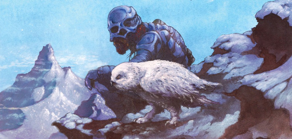
2. Ihsahn – Arktis.

Ihsahn is weirdo jazz-metal. They couldn’t go with a standard gut explosion like most metal bands do. The band incorporates saxophone, lots of electronics, and an unconventional singing style, so they needed an album cover that screamed “metal” while also suggesting that something different is going on. While the cover could suggest an ambient or jazz album to some viewers, metal fans should recognize the contrast and lettering as indicative of metal. The cross-country skier roaming on a frozen cragged tundra is an appropriate metaphor for the coldness that metal can give off, even though Ihsahn makes relatively warm and lively music for the genre. Perhaps the title Arktis. is meant as a contrast. This is really just a nice album cover that manages to convey what the band is offering without going overboard. I knew going in that it wouldn’t be typical metal, just because of this cover.
3. Pallbearer – Fear and Fury

Pallbearer are big in the scene, and they decided to stay relevant this year with a nice little EP in Fear and Fury. This album cover is extremely metal, but undeniably beautiful at the same time, which is quite a feat. It reminds me of the Baroness covers, which are some of the best in the game and if they had released an album this year it would certainly be on this list. The technicolor ensemble of embracing arms convey an uncommon warmth, conveniently juxtaposed with the arctic coldness of the previous album. The music inside is solid, if unchallenging, but Pallbearer do their thing better than almost anyone in the scene right now. This is the sort of thing I want to own because it looks beautiful, even though I wouldn’t listen to it all that often.
4. Deftones – Gore

Deftones managed to both be labeled as part of the nu-metal genre, which only their first album comfortably belongs to, and be labeled as the biggest band in alternative metal, neither of which accurately describe a band as complex as them. Though many aren’t fans of Deftones I do feel a certain connection and bias toward them, being a Sacramento native. They have had difficulty on the album cover front before, largely due to having “of the time” covers. Gore stands out among the band’s catalogue, both musically, and artistically. The flock of flamingos tint the cover pink, already distancing them from most metal (Boris and Deafheaven notwithstanding). Musically this is Deftones settling into a comfortable space with a collection of well written songs, it’s easily their best album since Around the Fur and no coincidence that it would come paired with their finest album cover.
5. Inter Arma – Paradise Gallows

This is a color scheme that seems to be popping up more and more lately, and with good reason. It suggest psychedelia and adventure. Inter Arma are relative newcomers but this album should put them on the map in no small part to the inventive cover. While it isn’t the best ship themed cover of the year (Vektor obviously dominates that category) it is quite colorful and made me want to listen a hell of a lot faster than if they had gone the usual route of gore splatter and impossible to read lettering, which to be fair is getting to be less and less common as the genre moves out of the basement and onto the blogosphere, becoming more accepted by “regular” music people than ever.
Featured image is from the album cover for Nattesferd by Kvelertak, an honorable mention from a stacked year for metal album covers.